Rock-paper… Café & co
Logotype and visual identity of the Aufbau Haus' café.
Collaboration with Laura Knoops.
Branding, Logo, Digital & Print Collateral.

Installed in the heart of the Aufbau Haus, a cultural and creative industries, schools and shops hub, Rock-paper… café & co has a privileged position to take part to Berlin's vibrant and creative life. Multicultural, welcoming and dynamic, the coffee's branding had to set the mood.
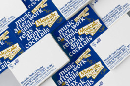
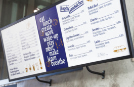
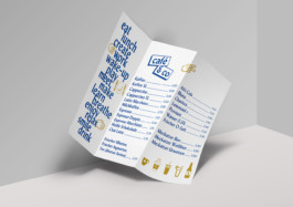
In order to present the café as a dynamic partner on a daily basis, we developed an identity defined by a singular and sharp typeface as well as a set of playful stickers and icons. The lists and repetitions give the identity its rhythm and flexibility, define the space for the customers and let them enjoy it. Stop by, drink, work, eat, meet, take a break…
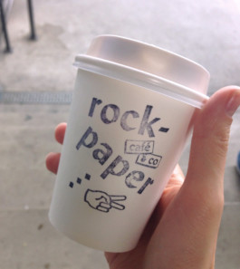

Rock-paper… Café & co
Creation of the logotype and visual identity of the Aufbau Haus' café.
Collaboration with Laura Knoops.
Branding, Logo, Digital & Print Collateral.
Built in 2015, the Aufbau Haus combines cultural and creative industries, schools and shops in the form of a factory building. It has developed as one of the most recognized location in the Berlin creative community. Located in the heart of the building, Rock-paper… café & co has a privileged position to take part to its vibrant and creative life.
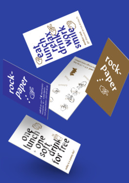
In order to present the café as a dynamic partner on a daily basis, we developed an identity defined by a singular and sharp typeface as well as a set of playful stickers and icons. The lists and repetitions give the identity its rhythm and flexibility, define the space for the customers and let them enjoy it. Stop by, drink, work, eat, meet, take a break…
© 2020. Lou Hillereau
© 2020. Lou Hillereau